Data Analysis with Sentinel Visualizer
Free TrialAfter using search to add entities and relationships on a Visualizer diagram, data analytics are available to find, filter, add, color and analyze.
- Find an entity on the diagram by searching for its name (Ctrl +F)
- Easily reduce the diagram to just the selected entities with or without their connected entities
- Only display linked or unlinked entities
- Filter the data by removing entities and relationships based on their characteristics
- Filter entities based on their details like Entity Type
- Filter entities based on numeric range values (low and high values)
- Filter relationships on their details like Relationship Type
- Filter relationships based on numeric range values
- Use the same data refinement to limit new data retrieved via Get Links
- Replace Entities based on their entity and relationship types
- Color and size entities on a gradient scaled based on their metrics
- Color and set the thickness of relationship lines on a gradient scaled based on their metrics
- Select two entities and perform Shortest Path and All Path analysis between them
- Identify entity cut-points to disrupt a network
- Calculate Cliques of closely connected entities within a network
- Select and filter individual networks
- Calculate metrics like Social Network Analysis (SNA)
- Apply date information for Temporal filtering and analysis
The Entities panel offers options to customize the display of entities on your diagram. When you click on an entity, it turns green and the entities connected to it are highlighted in blue. Easily reduce the diagram to just the selected ones with or without their connected entities.
 Entities panel offers many display options
The Show/Hide options let you just see the Linked Entities or Unlinked Entities. You can also show or not show the name labels of each entity, and the icon to expand or collapse their connections.
The Range Filter limits the entities in the diagram based on the low and high values of an entity metric. It can be set using a Squelch min/max bar or with explicit numeric values. The refresh button fills the minimum and maximum values for the data in the diagram which can be useful even if you don't filter the data. The range can be restricted to specific entity types.
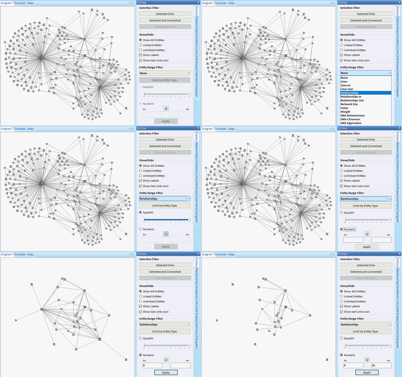 Example of a filter for Entities with 4 to 35 Relationships.
Some entities become disconnected because they are connected to entities that don't meet the filter criteria.
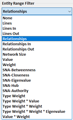 Squelch on many types of numeric values at the entity level, its network size, its entity type, SNA values, and combinations of them
The Range Filter limits the relationships in the diagram based on the low and high values of a relationship metric. It can be set using a Squelch min/max bar or with explicit numeric values. The refresh button fills the minimum and maximum values for the data in the diagram which can be useful even if you don't filter the data.
 Example of a filter for Relationships with a Line Sum of 300 or more.
Lines with lower values are hidden. Switch to Entities panel and select Linked Entities to focus on the most important.
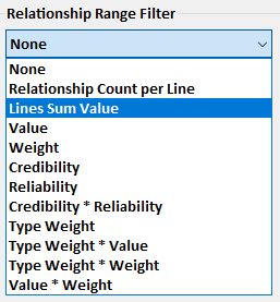 Squelch on many types of numeric values and optionally restrict it to specific relationship types
Data Refinement lets you choose the entities to select or show on your diagram. These settings can also limit the entities retrieved when Get Links adds additional entities.
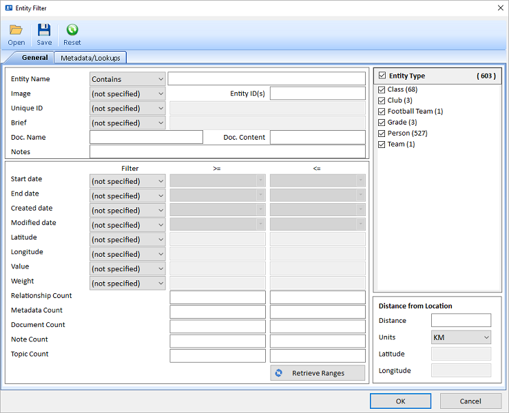 Criteria to specify the entities you want
The options are identical to the Entity Search's Advanced option and Entity Filter in the Advanced Dataset Builder.
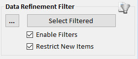 Apply Criteria to Select, Filter and/or Restrict Adding New Entities
Data Refinement lets you choose the relationships to select or show on your diagram. These settings can also limit the relationships retrieved when Get Links adds additional entities.
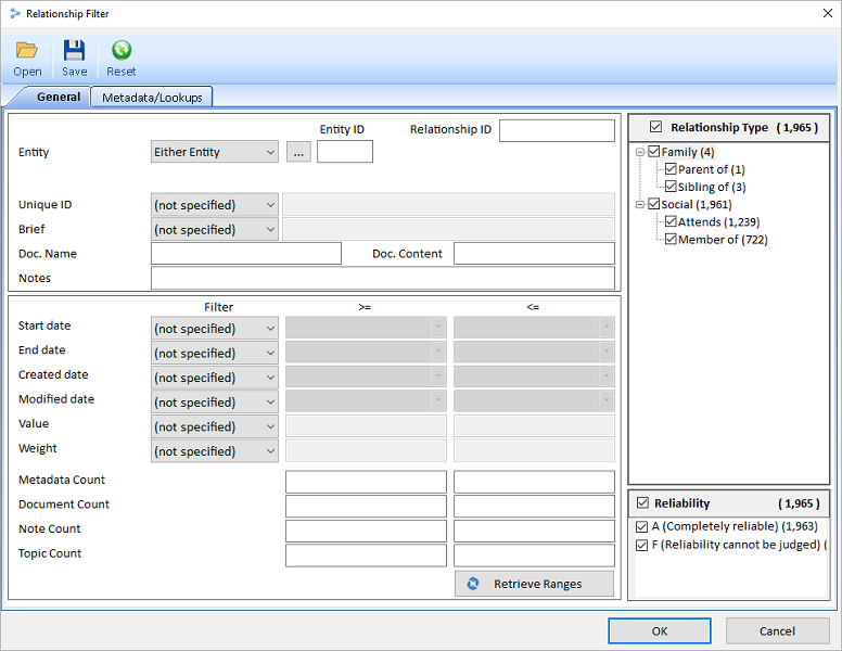 Criteria to specify the relationships you want
The options are identical to the Relationship Search's Advanced option and Relationship Filter in the Advanced Dataset Builder.
 Apply Criteria to Select, Filter and/or Restrict Adding New Relationships
Visualize your data even in the most complex inter-related network diagram.
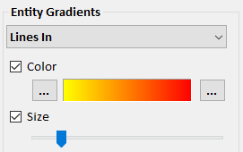
A wide range of metrics are generated to quickly see central and highly-connected players in your network diagram. Sentinel Visualizer applies numeric rankings to the visual appearance of the network. You can specify the colors for low and high values and relative size for entities and relationship lines.
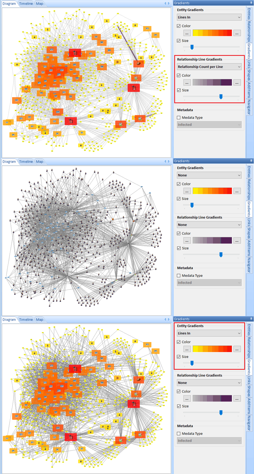 Example of Entity gradients and size based on Lines In, and Relationship Lines based on Relationship Count per Line
Set Entity colors and sizes
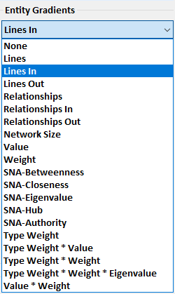
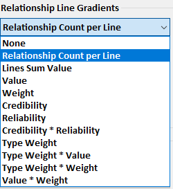
Set Relationship Line colors and thickness
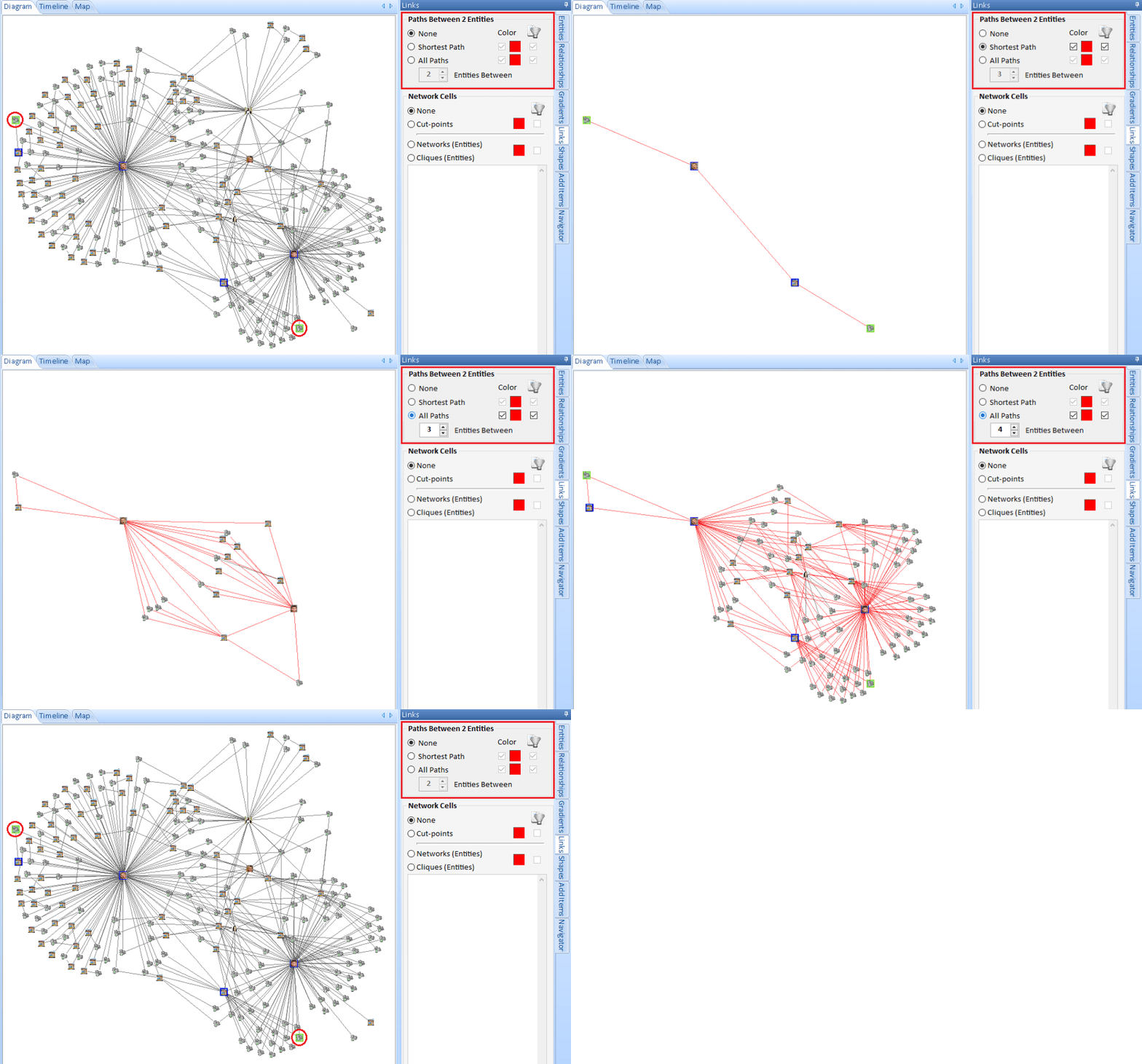
If you identified two entities of interest, you probably want to know how they are connected. Quickly see one of the shortest paths, or all paths based on a maximum number of degrees between them. You can filter out all the other entities on your diagram.
You can also start by selecting multiple entities and use the Get Links, Between Selected feature to add the fewest entities to connect them to each other.
By analyzing the results of network statistics, Sentinel Visualizer pinpoints and provides a visual representation of cells or cliques: groups of entities within a network that are closely connected to each other.
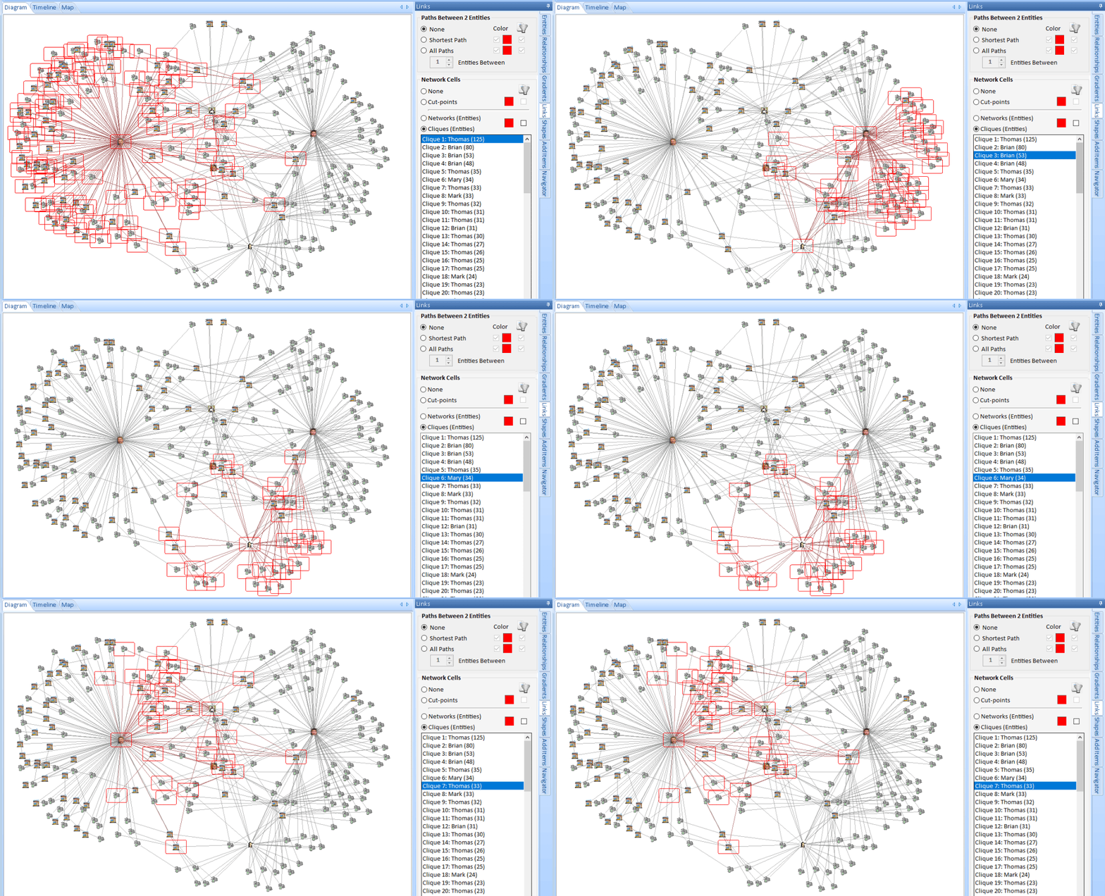 Select Cliques to list the cliques in your diagram. Select one to highlight it. Click the filter checkbox to just show its entities
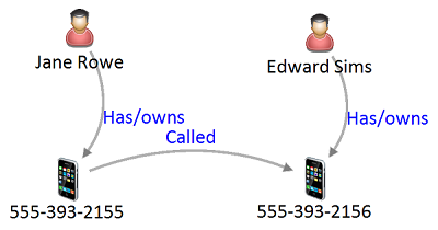
Keep and hide entities based on their entity and relationship types. For instance, you may have telephone call data showing calls between phone numbers and the owner of each phone. Entity Replace lets you replace the phones with their owners to show the connection between the people rather than phones.
Specify the entity types to keep and replace. Advanced options let you choose multiple entity and relationship types to keep and hide. Settings can be saved for future use and multiple saved replacements can be combined.
Entity Replace acts like a filter. Once it is set, if you add new entities to your diagram, like Get Links, the replacement is applied to the new entities. Turn off the Entity Replace to see to all your entities again.
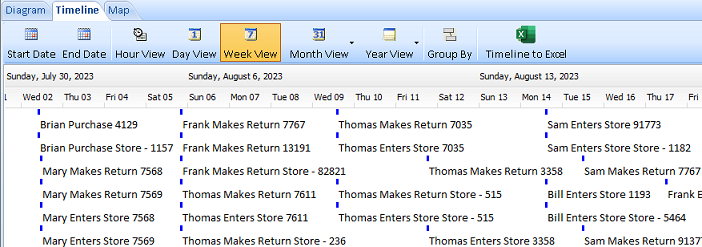
Sentinel Visualizer provides a powerful Time Range interface that hides or shows data based on a time slider control. Temporal Analysis makes it easy to see how networks form, change, and interact with each other over time. This capability allows you to spot patterns and predict actions and behaviors. The Time Range interface supports ranges down to the second level, and includes the ability to visually define time spans and ranges.

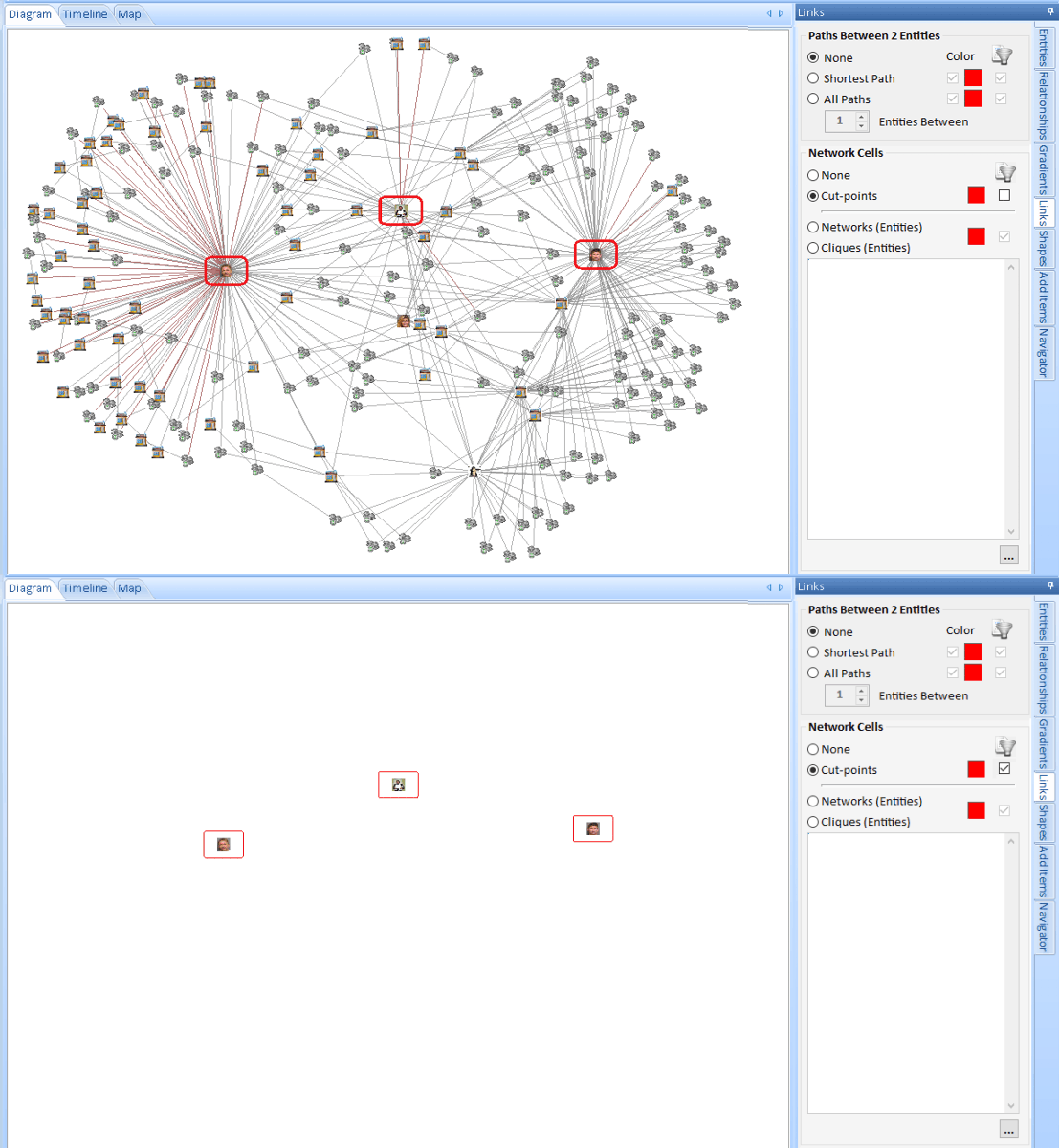 Select cut-points to highlight the entities, then click the filter checkbox to just show them
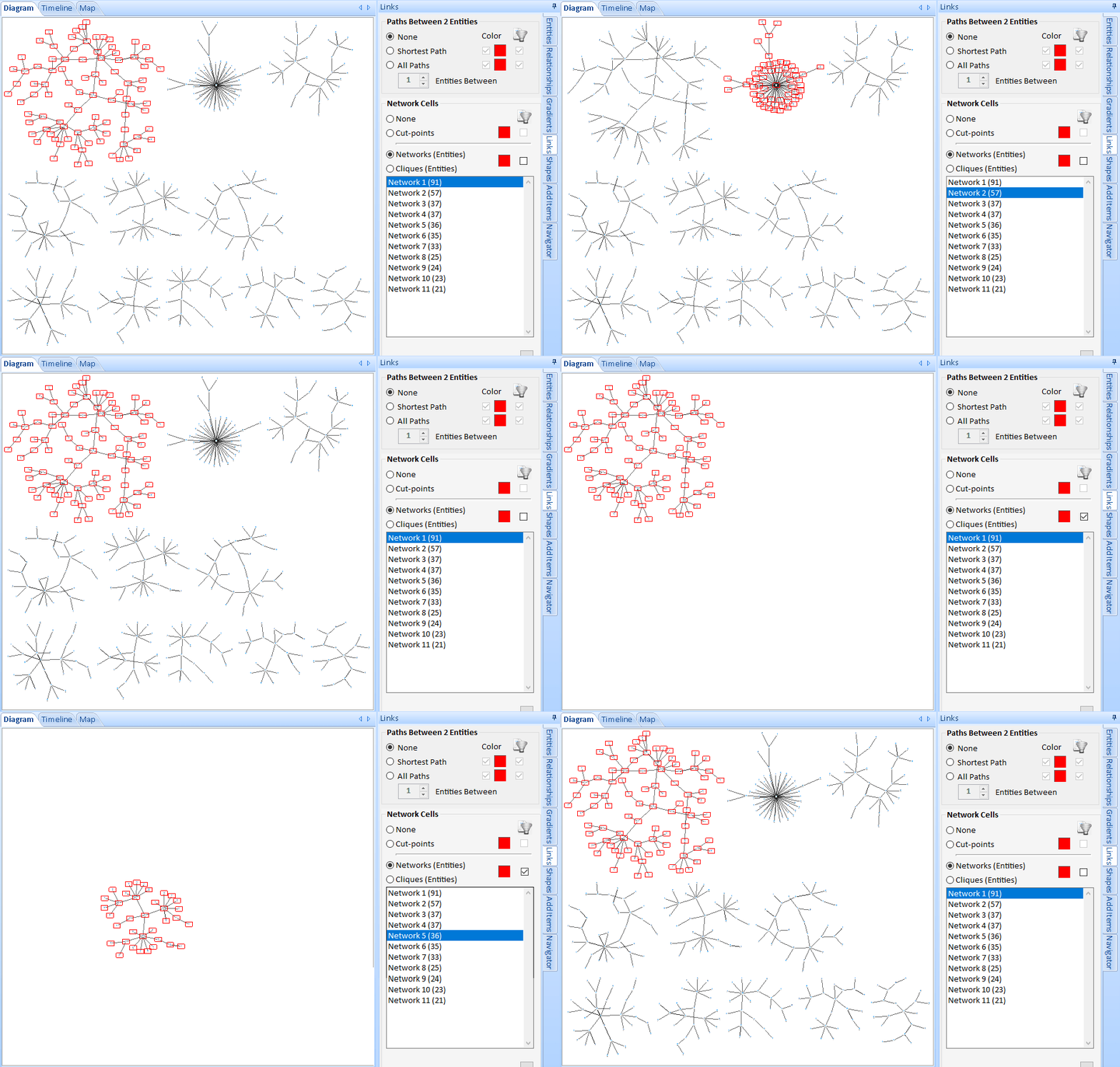 Select Networks to list them, select one to highlight it, then click the filter checkbox to just show the network's entities
